Summary
Game description: A 30-minute smartphone adventure running in Orientation Week at the University of Tasmania Inveresk Campus, February 2026. Aimed at new students. Based around the narrative of “Bianca, the university’s new AI assistant” giving a tour of campus to new students. Bianca’s coding is incomplete, causing her to glitch. Players input missing information by walking to various locations on campus, thus unlocking her “tour”.
Tools used:
- Smart phone (Oppo Reno F11) for filming
- Clipchamp (available through Google Chrome, logged in with University account) for video editing
- Chat GPT for vibe coding
- HeyGen for creating AI avatar video
- Free sound / image / video repositories online for stock footage / CC commons sound and music
- Easy WP and Elementor Pro, hosted by Namecheap via my personal website for hosting the game
Creation time: Casually (wasn’t working on it full-time) over Summer 2025 – 2026.
Reception: Didn’t get as much engagement as I’d hoped. I make an educated guess as to why and what I could do differently next time.
More detailed reflection
Origin:
In 2025, I made a game called “Liquid (a game in three drinks)” for a university unit. It consisted of three parts: a Twine game, hunt for QR codes (on university campus), and an audio walk. “Three Drinks” was deliberately crafted for a university unit I was studying in the theatre program, “Global Media and Cybertheatres”. I was invited to remake the game for a public audience, for an art exhibit in February 2026. I called the remake “Four Drinks”.

Context:
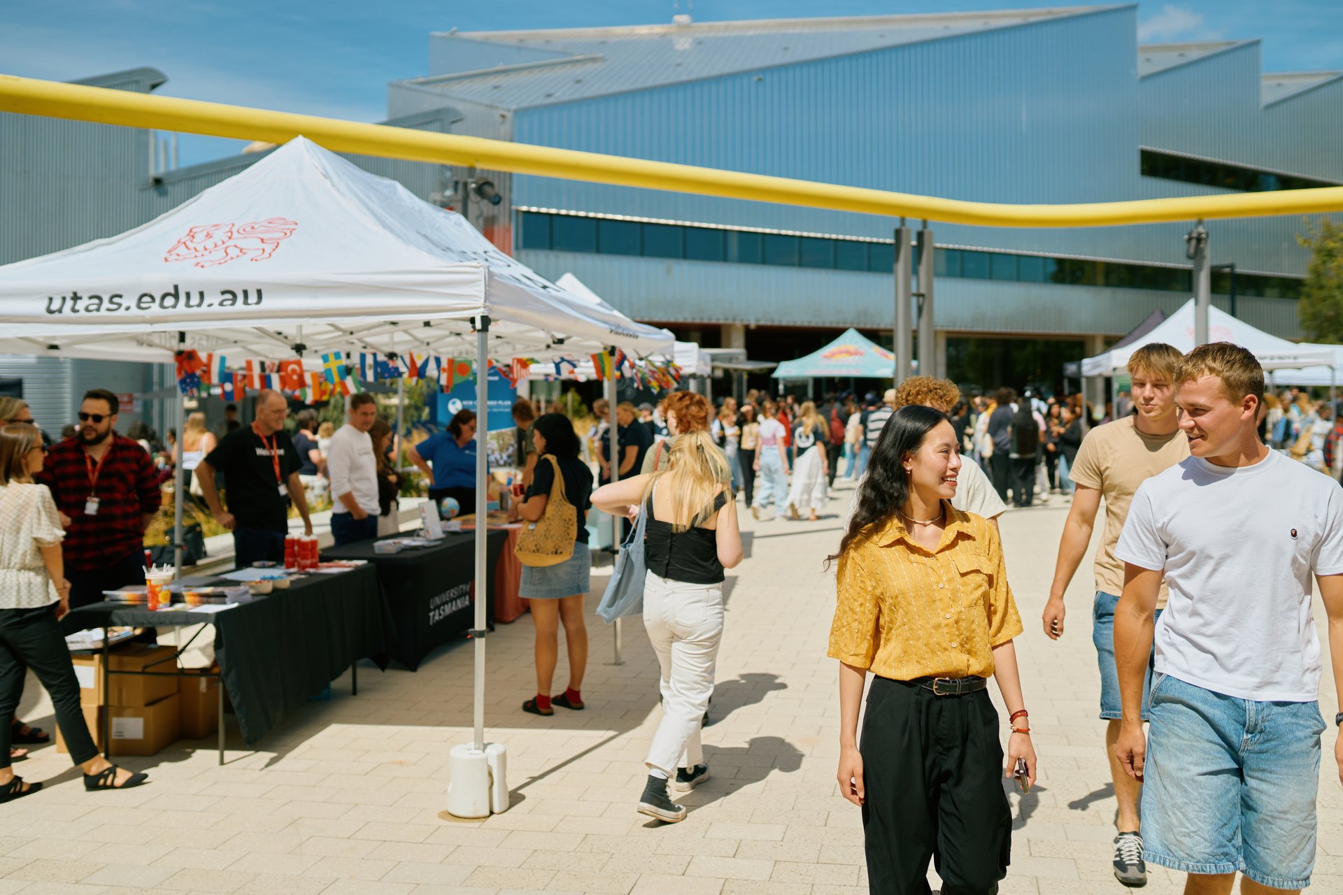
The art exhibit was being held on-campus in February 2026, during Orientation Week. This is a week where the university puts on various events to introduce new students to university, such as social dinners, invitations to join clubs, games, free BBQs, music and tours. The Launceston iteration of the accompanying art exhibit was in the Lantern Gallery, which is on the ground floor of the Workshop building.

Place:
I began creating by focusing on the workshop building itself. It’s a visually striking space. It also has an interesting historical story, which I only know a little of. I already knew I was creating a piece where a playing audience would be invited to walk around a space, guided by perhaps audio commentary or a set of instructions. Due to my audience (which I discuss down the page), I decided not to focus on the building’s history. Instead, I mapped types of places I wanted to take the players to during the walk. For instance, “a location that requires physical exertion to access”, or, “a location where the player can watch others from a distance”. I thought by choosing specific kinds of places I could invite players into multiple kinds of experiences.
When I began making the piece I’d assumed I’d be in Launceston mostly full-time. Due to a rapidly evolving situation, I was actually in Hobart most of summer, with a few, short trips up to Launceston (two and a half hours away). This meant I was planning a place-based artwork, while not being in that place. Mapping the kinds of places I wanted meant when I got to Launceston, I’d have criteria to choose my locations by. I wanted to choose kinds of locations so I could easily create a mirror version of locations in Hobart when I set the game up there. The game didn’t end up running in two places, but it was still good practice for how I would set up a place-based piece of theatre, which I might later re-stage in a different location.
Audience:
The art exhibit was running during orientation week. This meant a potential audience would likely consist of mostly students in their first week at uni before classes began. In general, I assumed these things would work for this audience:
- Short form content
- Explicit, clear instructions when playing a game (especially as they weren’t expecting one)
- Technology
Based on this, I didn’t build the narrative around the story of the workshop building. To do that topic justice, I would have had to present longer-form content.

Game structure:
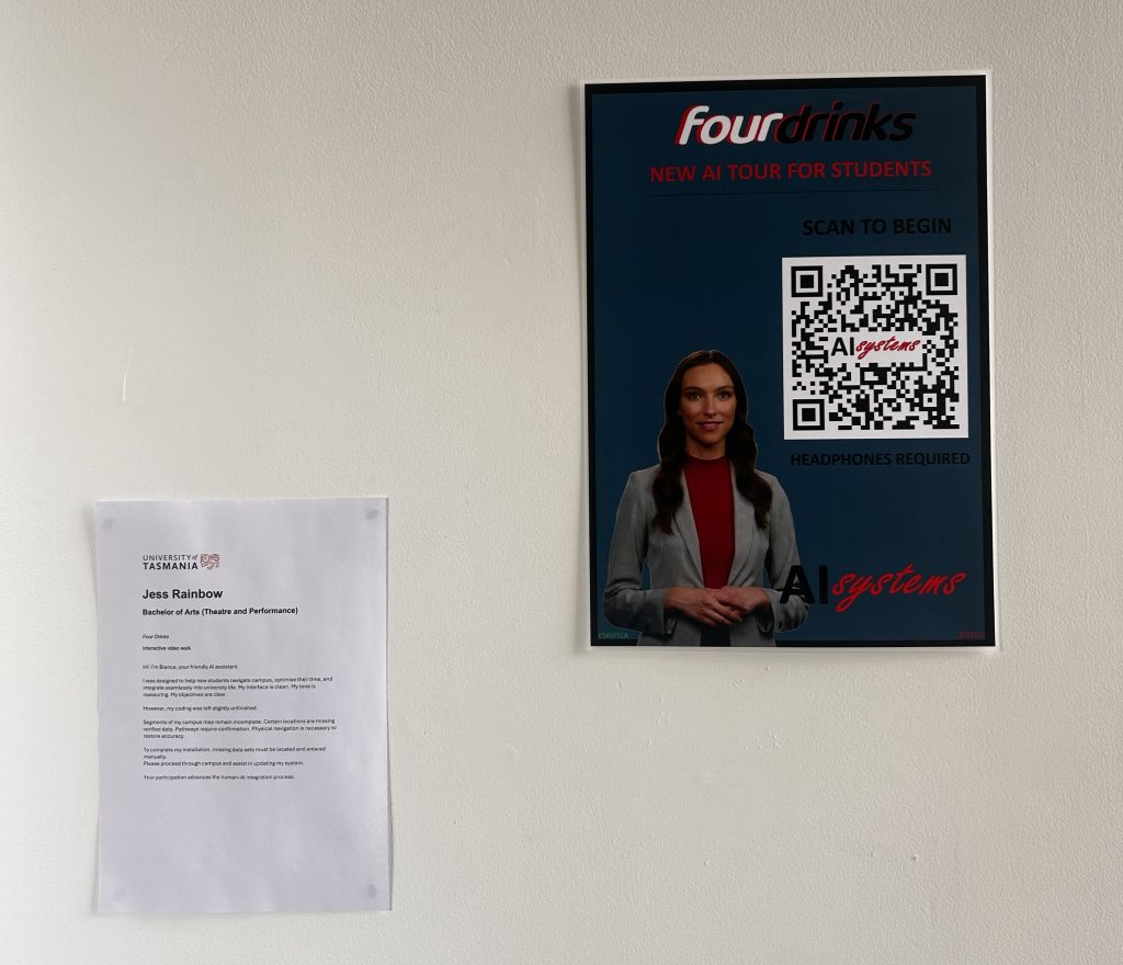
I presented the game in video form. It began with the player scanning a QR code on a poster, leading into the first video – around twenty seconds long. This led to another video, which asked the player to find a location within the university and enter it into a website. This then unlocked another two videos, leading to a second location and unlocking a second “tour”. This led to a third pair of videos and a third location. Finally, the player was led back to the original poster in the Lantern Gallery, asking them to input a final code and make a choice. The final code unlocked a final video and an optional guestbook, the entire adventure taking about thirty minutes to play through.

World of the fiction:
The narrative was originally inspired by the idea of “four drinks” – meaning, the player would go to four locations, each paired with a drink. For instance, a tap in a kitchen or a vending machine. The name “four drinks” was also word play on “foursquare”, an app from around 2010, where players could “check into” locations and leave reviews. I created the “four drinks” logo based on the old foursquare logo and considered having players leave reviews of the locations within the university they went to. I decided this could make players opt out, if too much was asked of them or the game was too complex. I replaced “leave a review at each location” with an optional guestbook at the end of the game.
I was using chatgpt to create a lot of code on the website (“vibe coding”). I was inspired by this and the building of a new AI data centre in Launceston. The narrative changed from an app, to an “AI generated tour of the university”. This felt suitably corporate, as I have seen some of the university branding be. It gave space to explore how ingrained AI has become in university life and learning and the consequences of that.
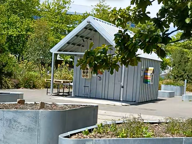
The completed narrative centered around “Bianca, the university’s new AI assistant”. Bianca was designed to generate a tour of the university for new students. However, her coding had been left unfinished – the campus maps uploaded to her mainframe didn’t contain all required information. This meant to unlock the tours, players had to enter information manually. This served a mechanical, as well as narrative, function. It meant a player had to physically go to each location, in turn, to unlock the next video. Once the player had found the information (a specific room number, the name of a structure in the community garden, and the year a painting in the library was completed), they entered it into a field on the game website and submitted it. A correct entry unlocked the next video. This meant I was leading players on a walk, from place to place, and they had to be in those places to take the walk.
The final code entered was on the poster itself – in tiny letters at the base. Entering the “green code” would complete the installation of Bianca across all systems. Entering the “red code” would shut Bianca down and delete the AI program.
The tours:
The tours Bianca gave were each a 1-2 minute video. I filmed video on campus, then mixed it with stock footage and AI generated pictures and video. The tours were partly accurate information (“the community garden contains all sorts of plants!”). They were also partly nonsense (“the Inveresk library is the third tallest library in the world. We don’t know how many floors there are, because no one has bothered to climb all the stairs”). This was an opportunity to play with my love of nonsense and absurdity. It also showed how AI will often give inaccurate information, stating such information confidently because it is designed to stitch together plausible-sounding words, based on what probably comes next in a string of text.
At the end of the game, the player is invited to install the AI across the campus or shut it down completely. This comes after a series of “hints” that AI may not be all that is promised. assistant referring to books as “relics, now that all thinking can be outsourced”, and explaining the “new data centre will advance the human-AI integration program”.
Reception:
Had I been in Launceston, I would have surreptitiously set up camp near the poster during orientation week to observe people scanning my poster, observing who scanned it and how they engaged. Because I was in Hobart, I used electronic tracking via Google Analytics. This allows me to see engagement with my website within the most recent thirty minutes, as well as a longer period report (e.g. weeks). This data is void of the more useful psychographic information, however, so I have made some educated guesses about its meaning.
Over three weeks, I recorded seventy hits to the “four drinks” URL, from QR code scans of the poster. Average engagement time after scanning was fifteen seconds. This was about enough time to scan the website and watch most of the first video – but not to play the full, 30-minute game. I promoted the game with a short video via social media (Instagram, Facebook, Bluesky) and got very little engagement there too.
These metrics can be a place to start exploring what kind of art this audience is drawn to, and perhaps why.
What did I learn from creating this?
First, it was an experience in adapting an already existing piece to a new audience and context. This was an exercise I’d practiced in the “Critical Theory: Networks” uni class the semester before, but now I got a chance to do it “for real”. This involved considering the qualities of the audience and space to create for a specific cohort. That said, it doesn’t seem my efforts were successful, because not many people engaged for the length of the piece.
Second, I was able to play with technology in a way I hadn’t before, and I learned a few new tricks. For instance, animating text to look like it was typing, creating an AI-generated avatar and new uses for a single URL so it would react “like an app”.
Third, it was my first time sharing a diary of my “work in progress”. I made short, video journals of my process and uploaded them during January and February. This involved being open about my process, thinking, inspiration – and how they morphed and evolved.
What did I learn from audience engagement?
I haven’t been able to talk directly with people who decided to scan, or not scan, the QR code. I do want the opportunity to learn from this experience though, so here are some possible reasons I’ve come up with for lack of engagement:
- Participatory art requires more effort and investment than just viewing something for a few seconds, then moving on. People who scanned the code may have not been interested in this kind of art enough to dedicate time and energy to engage. Or, they could have been potentially interested – but not wanting to play at that specific time.
- People didn’t realise there was more to the experience than simply watching the first video.
- People didn’t realise this was a piece of art, and thought it was actually a corporate-style AI tour of the university.
- People did realise it was art, were in the space to play a piece of theatre and did realise there was more to the piece than just the first video – they just weren’t engaged with this specific artwork.
Regarding, “people didn’t understand” (either that this was a piece of art, or that it required more interaction) as a reason for lack of engagement: I don’t think I could make the art any simpler than it was. Or, rather, I wouldn’t want to make it any simpler. The same goes for, “people didn’t like this art” as a reason to not engage. Not everyone will enjoy art I create, and that is okay. I can adapt work to an audience and context, but not to the point of muting myself artistically. Therefore, going forward I will try to address the other reason people may not have engaged – namely they were interested, but didn’t have the time to fully buy in there and then.
Creating a new piece, it would be ideal to have an audience ready for this type of experience. Rather than a poster in an art gallery, something that was advertised on its own as “a participatory piece of theatre using a smartphone, which will take around thirty minutes”. If the piece were advertised in advance (e.g. people had to book and then turn up to a specific location to play), they would be more prepared to engage when they arrived.
I could also ask for some sort of investment, up-front, from players. This might be effort, such as answering an email. Or it could be monetary, such as paying $5. Although these are both small actions, they’d create a sense of having invested in the experience – so being less likely to opt out part-way through.
Third, choosing a different audience may have better results. The factor that united this audience was their connection to the university – not that they all wanted to play a smartphone game. Connecting with community who are already engaged with these kinds of experiences may work better. For example, people who play ARGs or LARP.
Conclusion:
Creating this piece was an expansive experience in my learning and artistic process. It challenged me to create in ways I hadn’t before. I learned some new skills during the journey. I also had the experience of creating participatory art that didn’t get participated in. This has sharpened my desire and intent to create art that does get played and enjoyed.